CASE STUDY
Aloha Speech Pathology
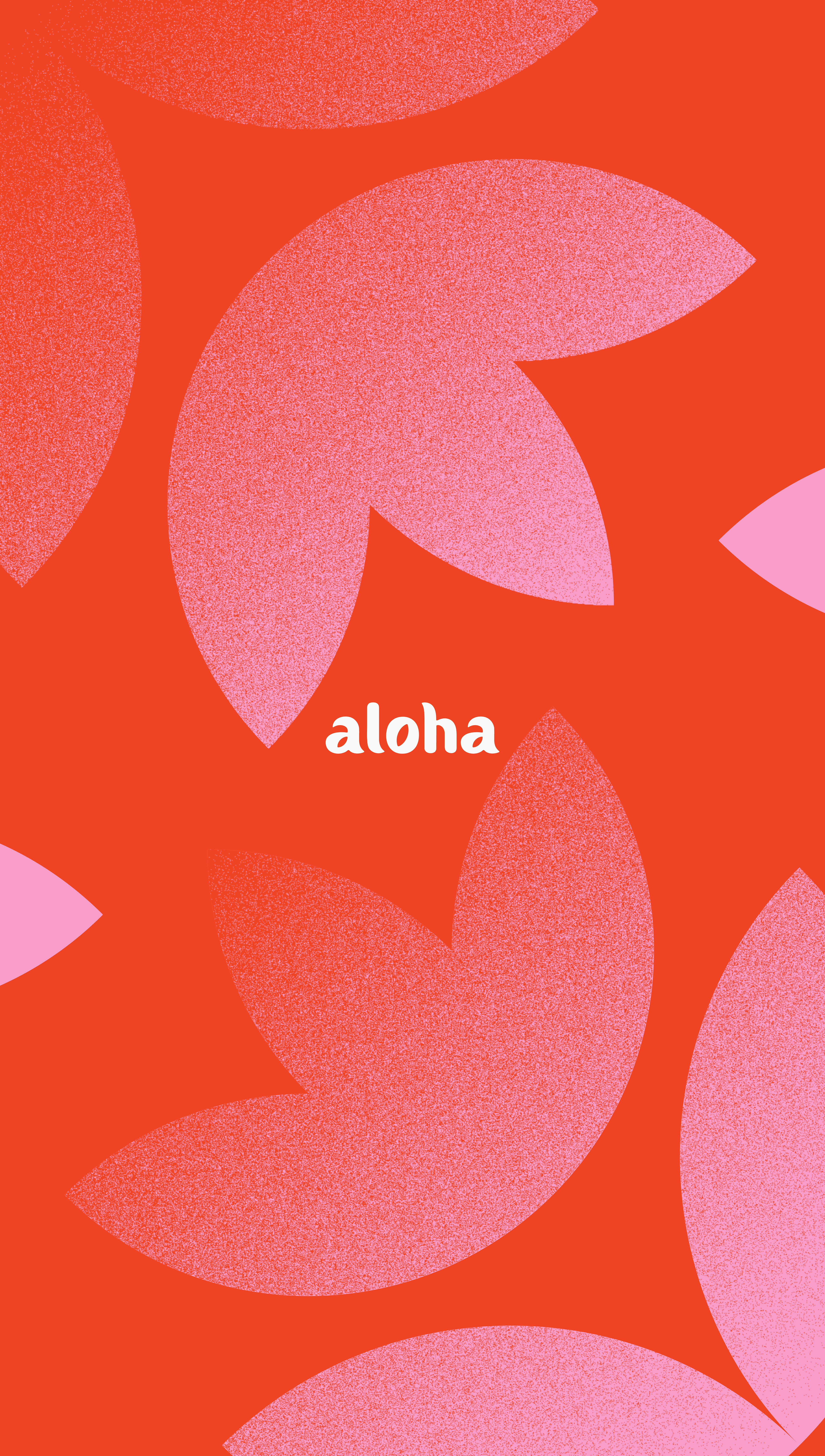
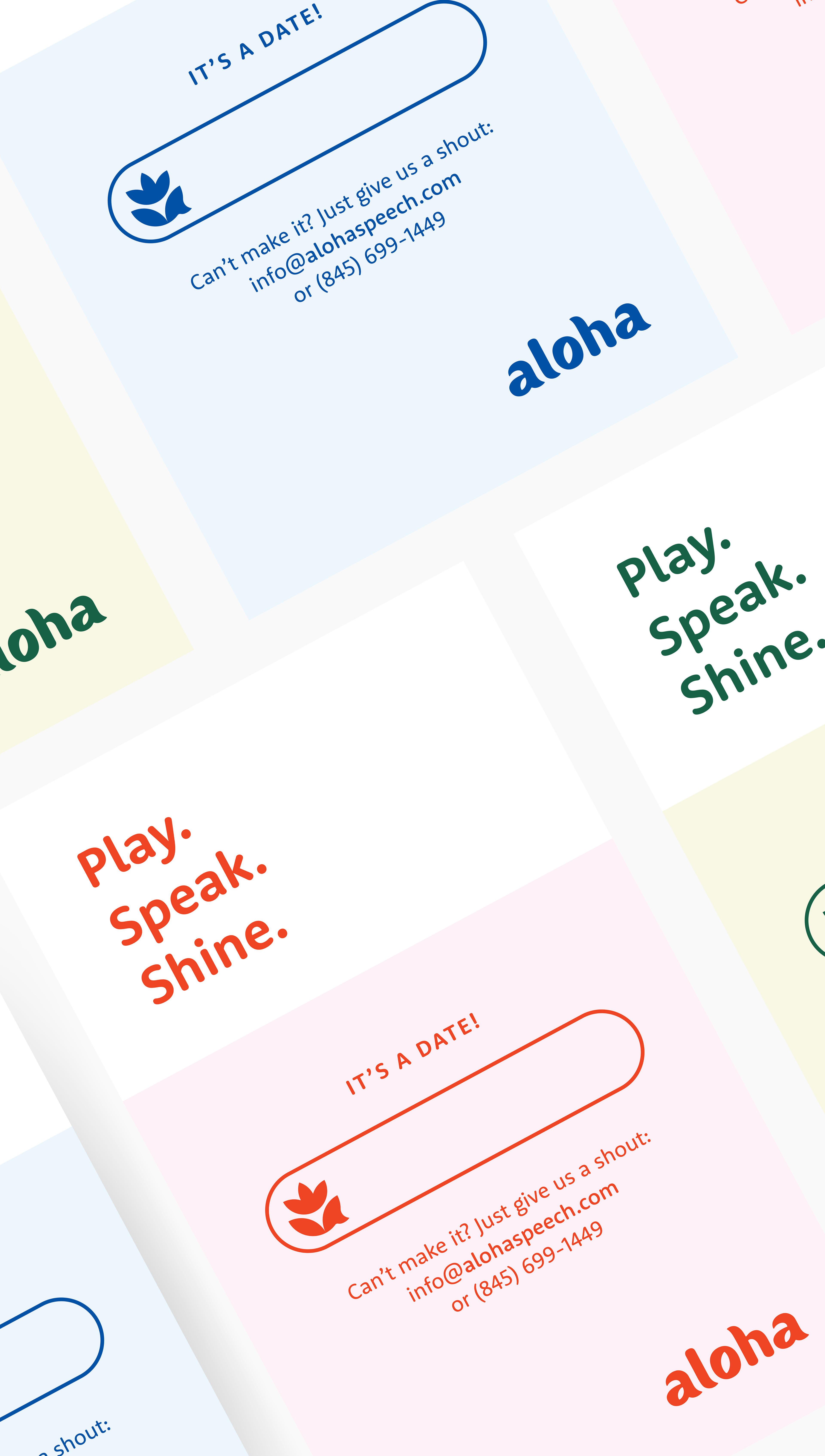
Inspired by the deeper meaning of aloha — not just “hello,” but breath of life — the brand centers on growth, voice, and connection. These themes shaped a system that’s warm, expressive, and intentional.
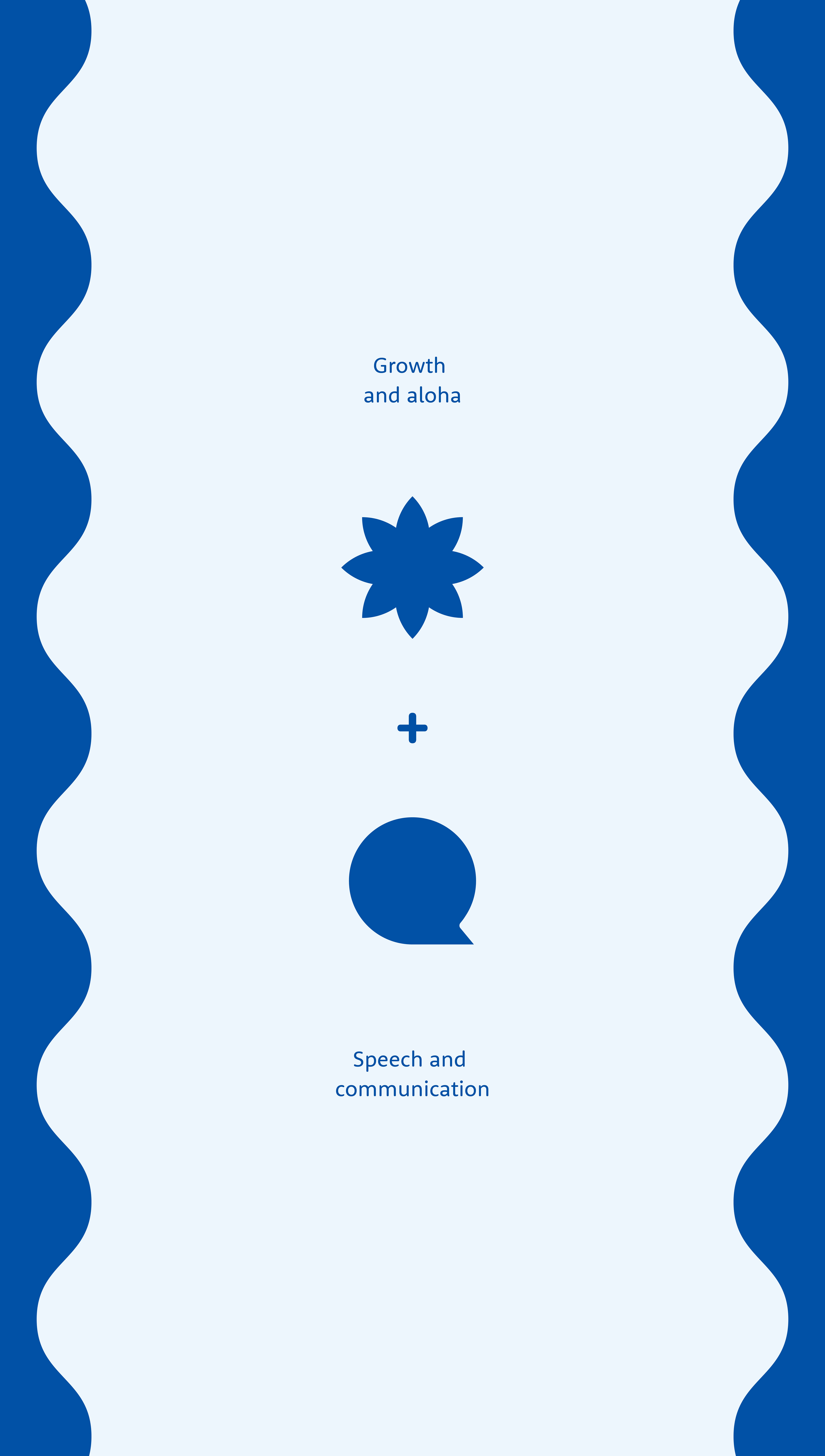
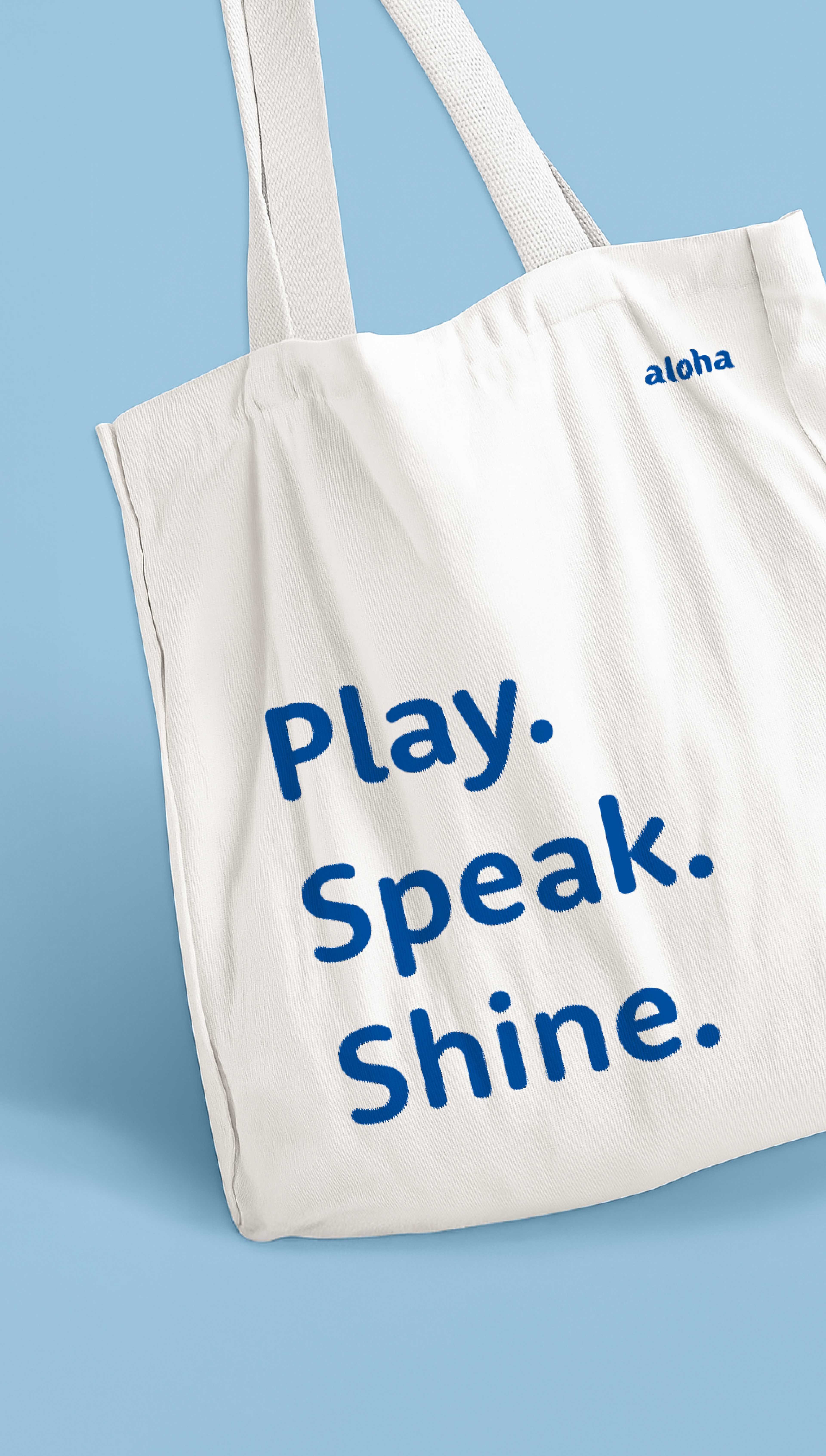
The logo mark merges a stylized flower with a speech bubble, symbolizing communication and organic growth. The logotype echoes these ideas: leaf forms appear in the counters, and subtle curves nod to speech bubbles in the letter tails. Together, the system feels soft, smart, and joyful: just like the families it’s made for.
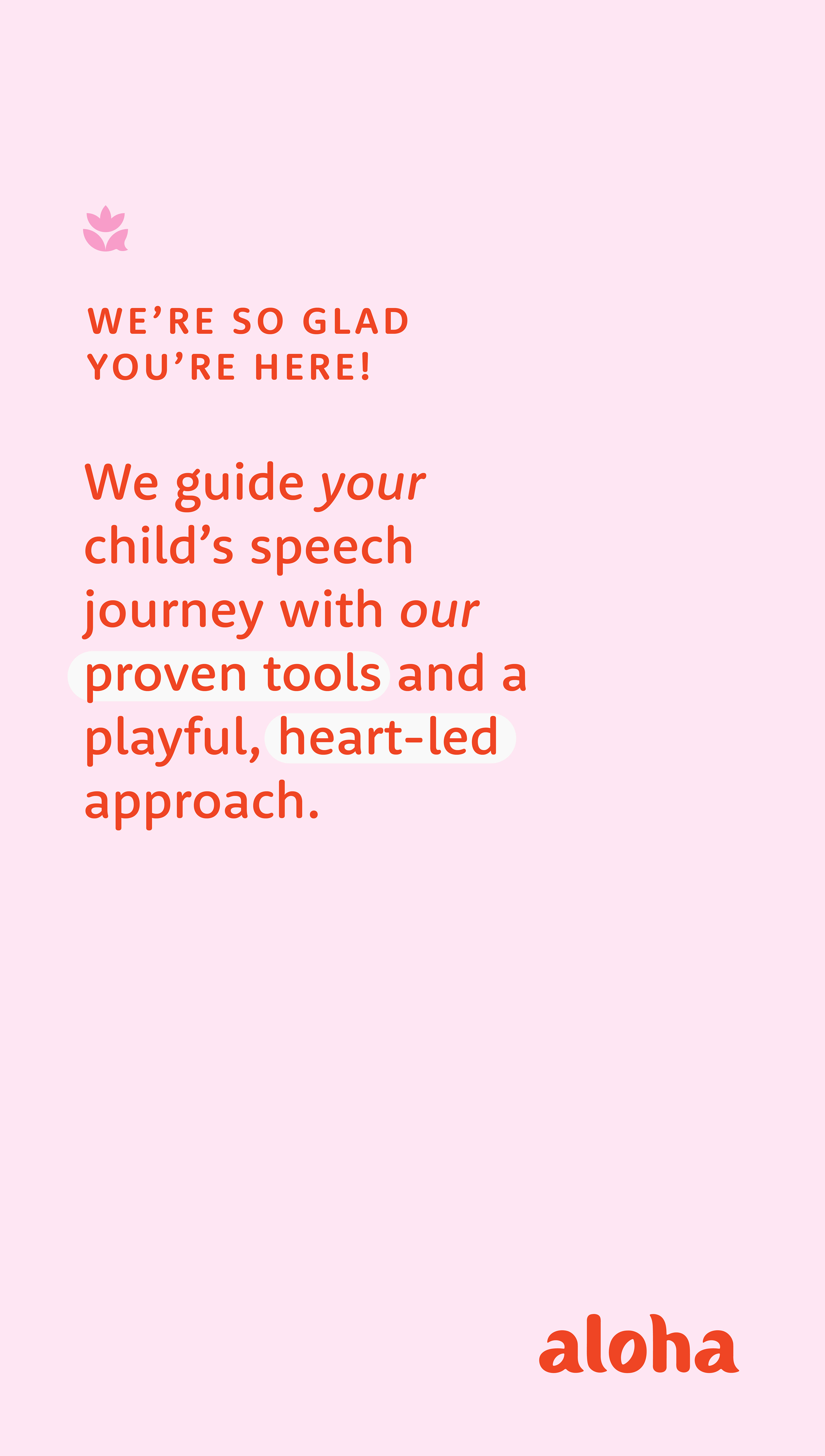
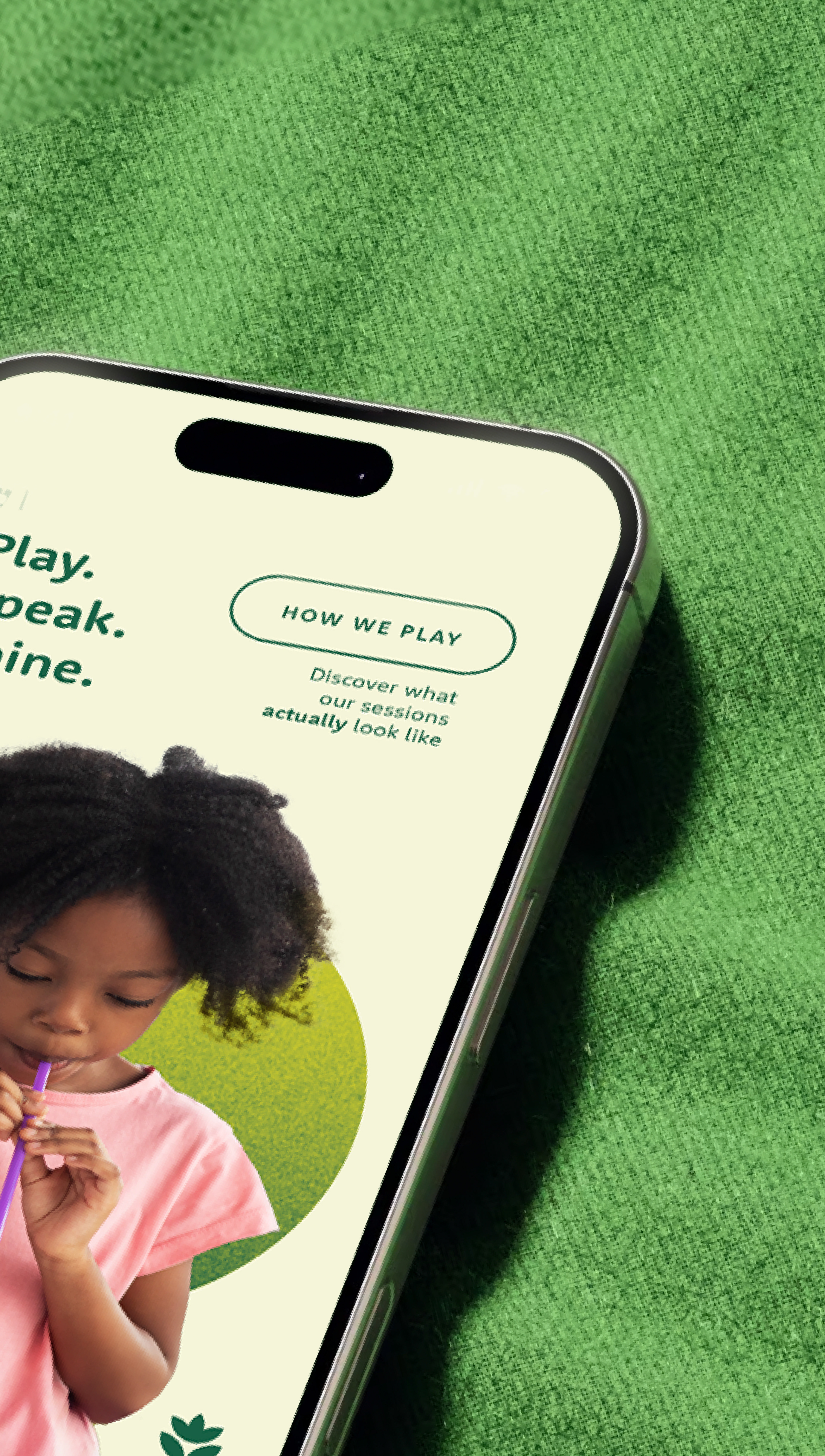
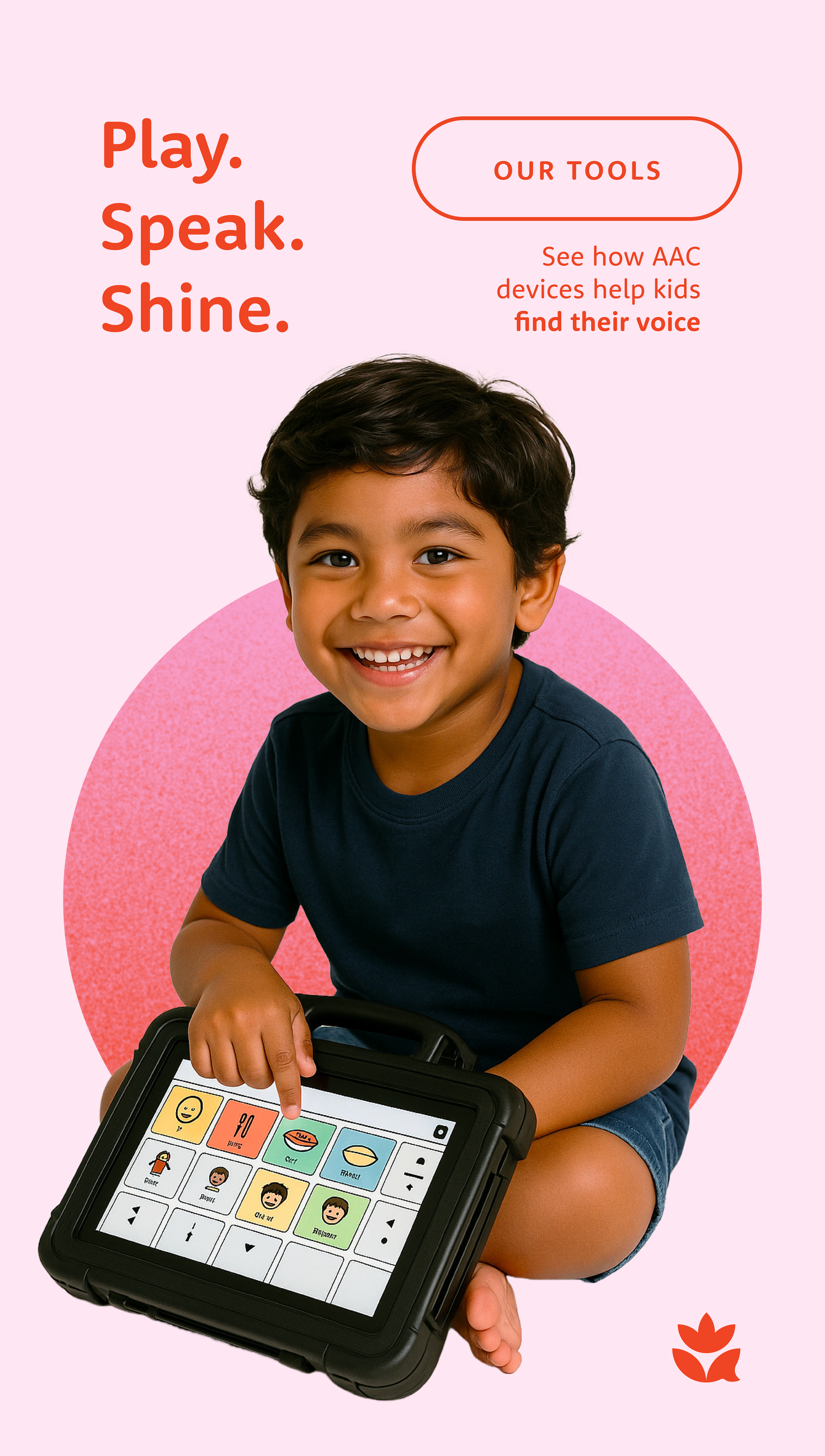
Messaging throughout the brand speaks directly to parents and caregivers, offering clarity, empathy, and encouragement at every touchpoint.
DELIVERABLES
Brand Strategy, Messaging, Visual Identity, Copywriting, Creative Direction, Concept Development.
Brand Strategy, Messaging, Visual Identity, Copywriting, Creative Direction, Concept Development.